ProInspire is getting a makeover! A sneak peek of our new branding
We are excited to share a sneak peek of our new branding. After a year of gathering input from alumni, advisors, funders, partners, and program participants, as well as many discussions among our team, ProInspire has a new brand! We plan to roll out our new branding over the next few months, and wanted to share a preview here on the blog.
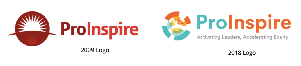
From Monisha Kapila, ProInspire Founder and CEO: “I chose our first logo when I launched ProInspire in 2009. As a startup nonprofit, I used a low-cost online service and chose our logo from a few options. I was drawn to the first logo because of the optimism of the sun and boldness of the color red. Under this branding, ProInspire launched the ProInspire Fellowship, Managing for Success, and other activities that helped establish our strong community, deep partnerships, and network of leaders.”
As we near the end of 2018, we want the brand to reflect where ProInspire is today. We remain committed to developing leaders at all levels for the nonprofit and philanthropic sectors, and we recognize how we accomplish that goal must evolve. Rooted in a belief that equity and leadership are key to to the systems change needed to advance social impact, our approach is changing — and with it, our branding. We also chose this moment to update our branding to commemorate ProInspire’s 10th anniversary in 2019.
About the New Brand
There are three key components to ProInspire’s new branding, and we want to share a little more about how we arrived at each of them:
- Logo. We wanted our logo to convey the motion and energy of our work. The new “kaleidoscope” icon represents the multi-faceted nature of our work to activate leaders and accelerate equity. The three nested circles represent the fact that our work occurs at the individual, organizational, and systems levels — but that the boundaries between each are not always fully delineated. The pieces converging toward the center of the icon represent equity at the center of our work.
- Tagline. We decided to introduce a tagline so that people would better understand what ProInspire does. After much deliberation, we chose “Activating Leaders, Accelerating Equity”. While we have used “developing leaders” in the past, we recognized that our role is more about supporting leaders and not teaching them. We also wanted to describe the result of the work we do — which is about accelerating the social sector towards equity and justice.
- Colors. In parallel to our branding work, we invested time in clarifying our core values. We chose a vibrant color palette with shades of orange, teal, and yellow to reflect these values, and we look forward to sharing more about them in the near future.
What’s Next
Over the next few months, you will start to see our logo in different places. Equity in the Center’s new logo, which uses the same icon and colors, is being rolled out at the Equity in the Center Summit on October 9th – 10th. We will use the new logo in our Giving Campaign in November. By late February, you will see the new visual identity applied to our new website, social media, emails, program materials, and more.
To our community, we thank you for playing a valuable role in our rebranding process, and hope you share our excitement for the new look and what it means for our shared work.